Pop Quirk Cosmetics
Brand Identity
Package Design
Art Direction
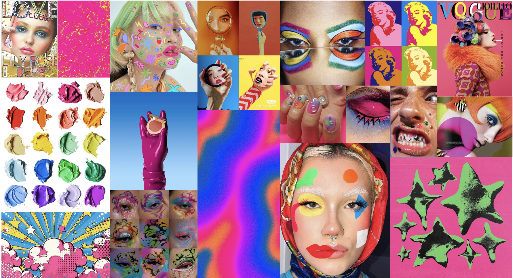
Photography
For this project I was promted to create a brand identity within the cosmetics industry with the letters ‘P’ and ‘Q’. I created Pop Quirk Comsmetics, a brand focused on transforming the makeup industry into a more inclusive and accessible space. This brand is upbeat, bright, bold, and unapologetically itself.
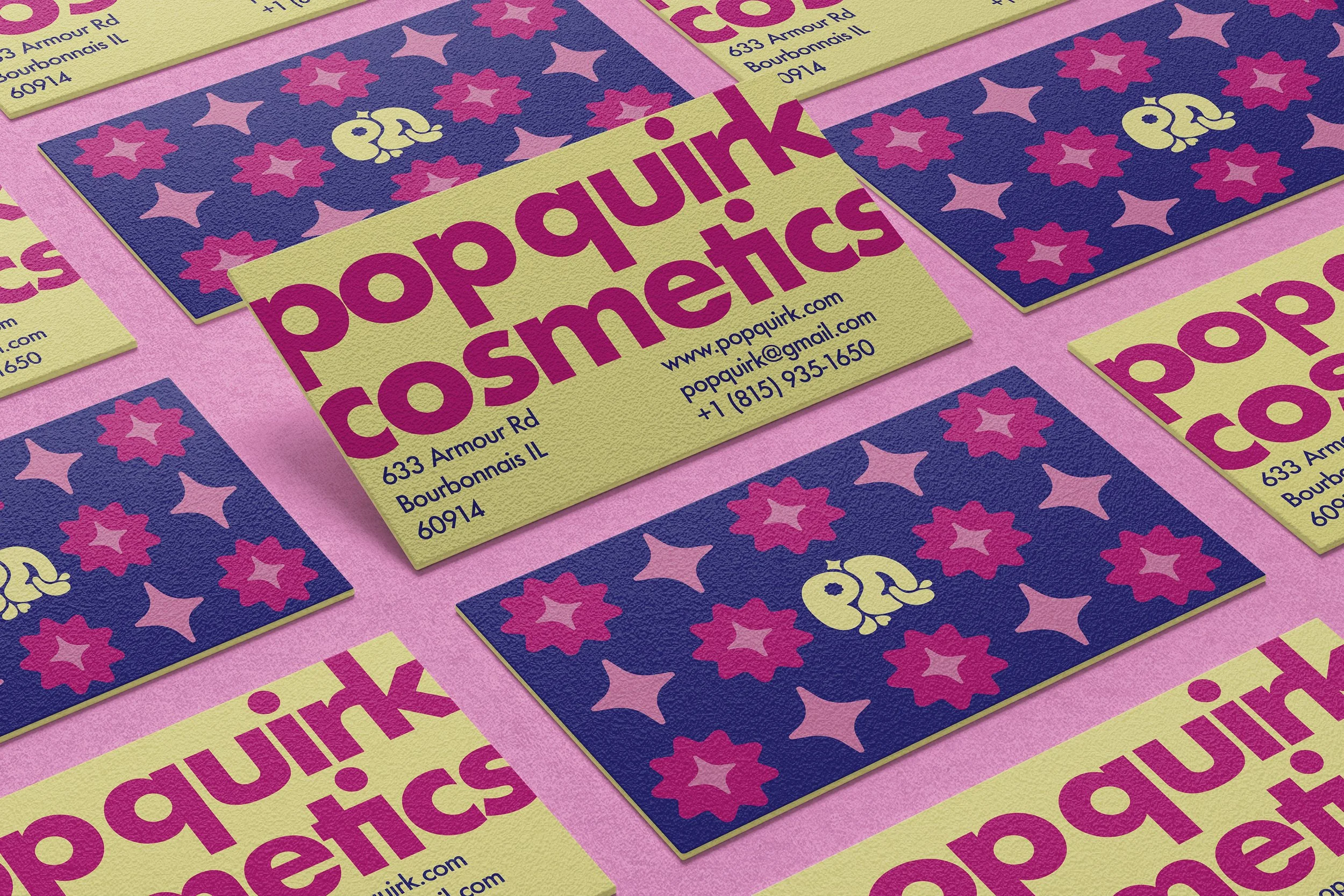
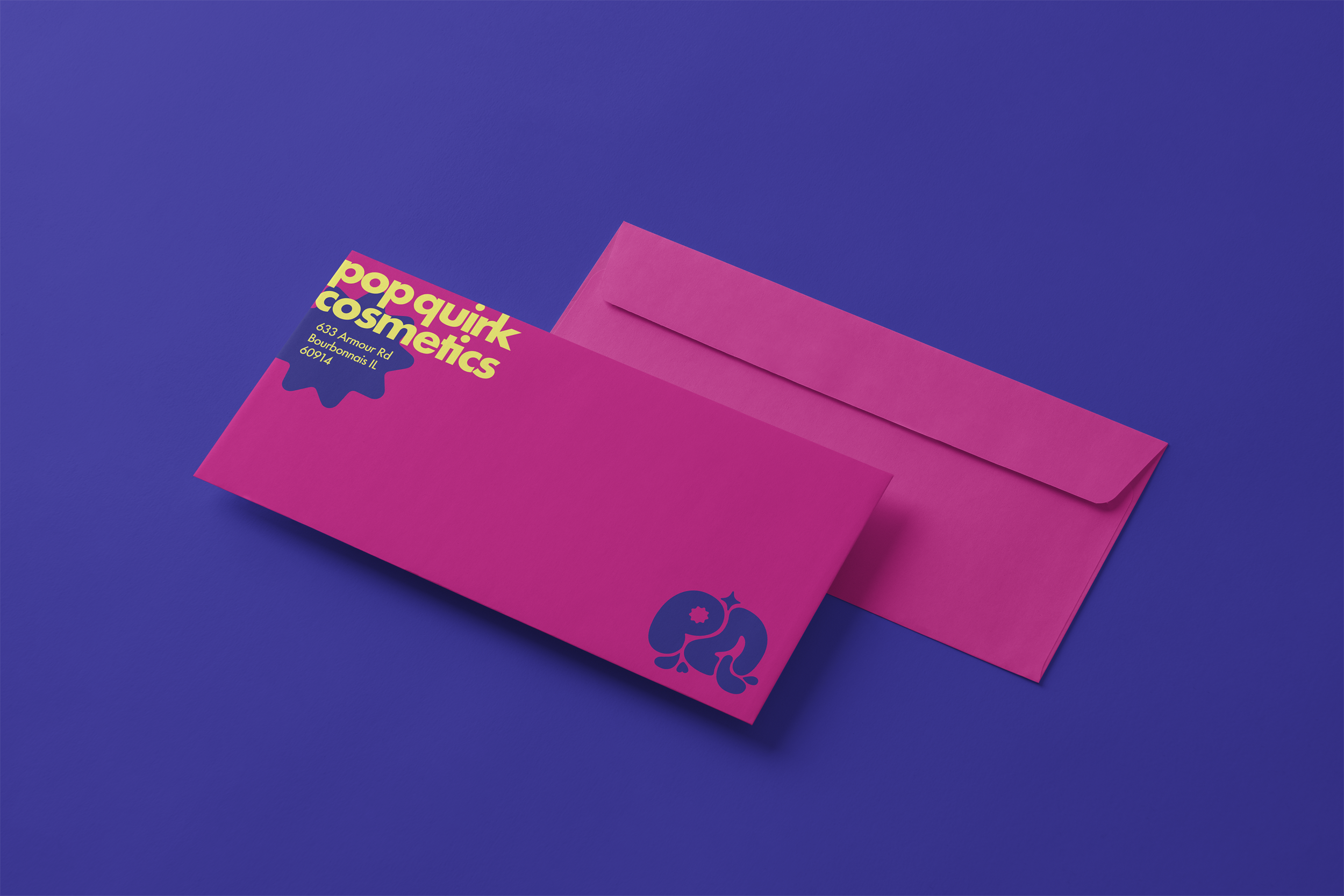
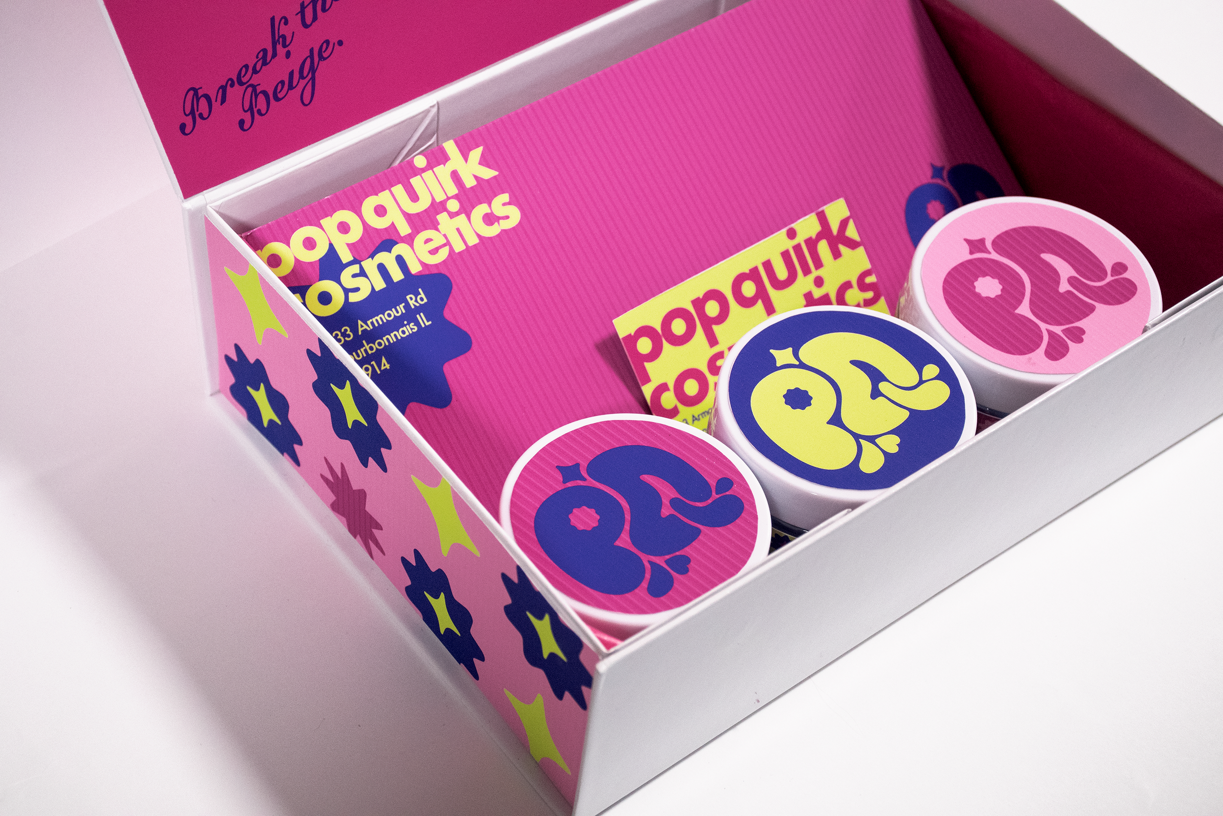
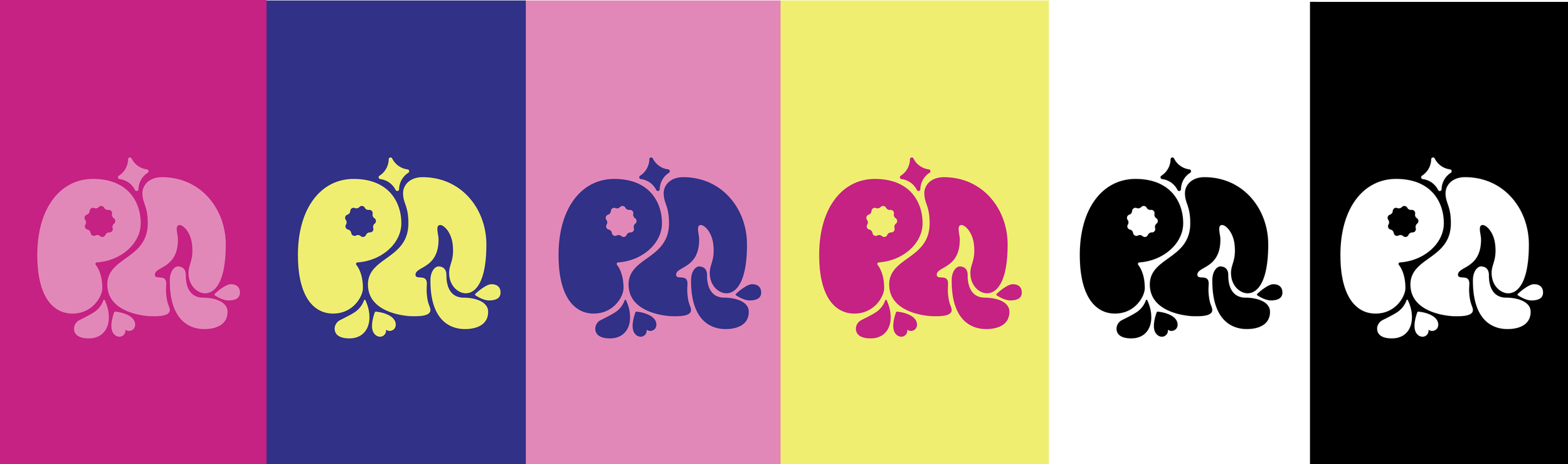
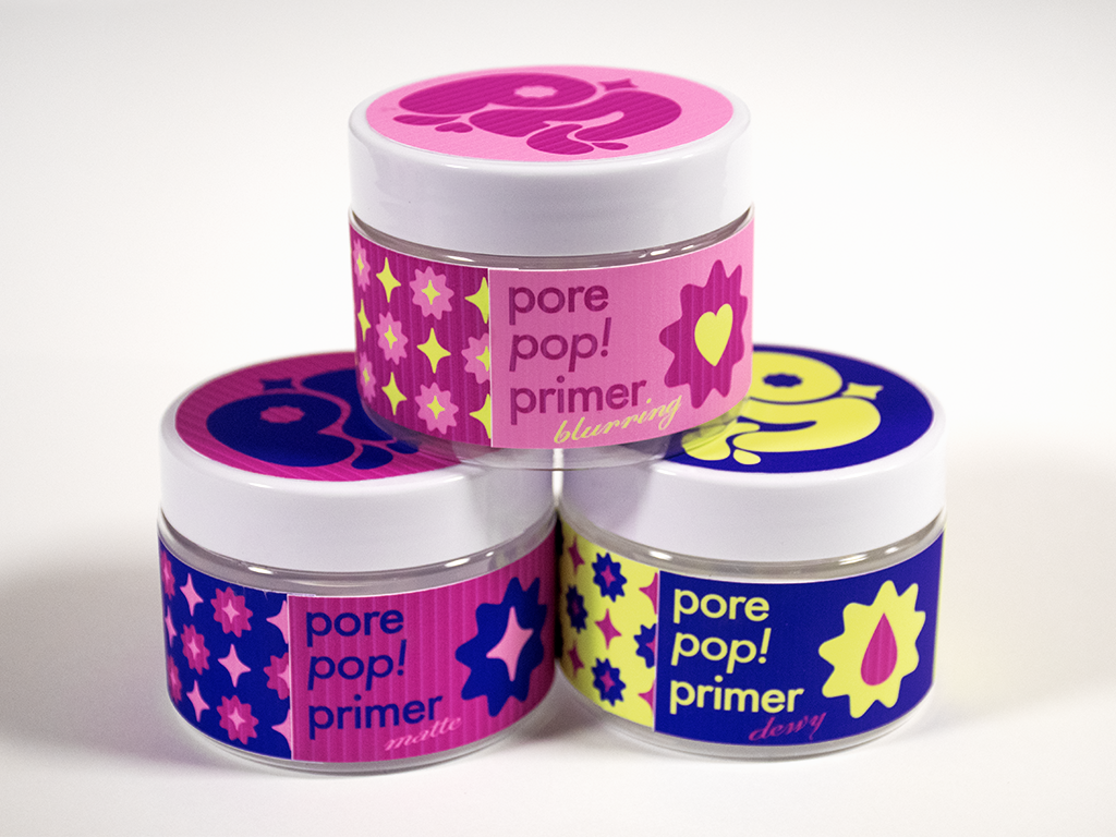
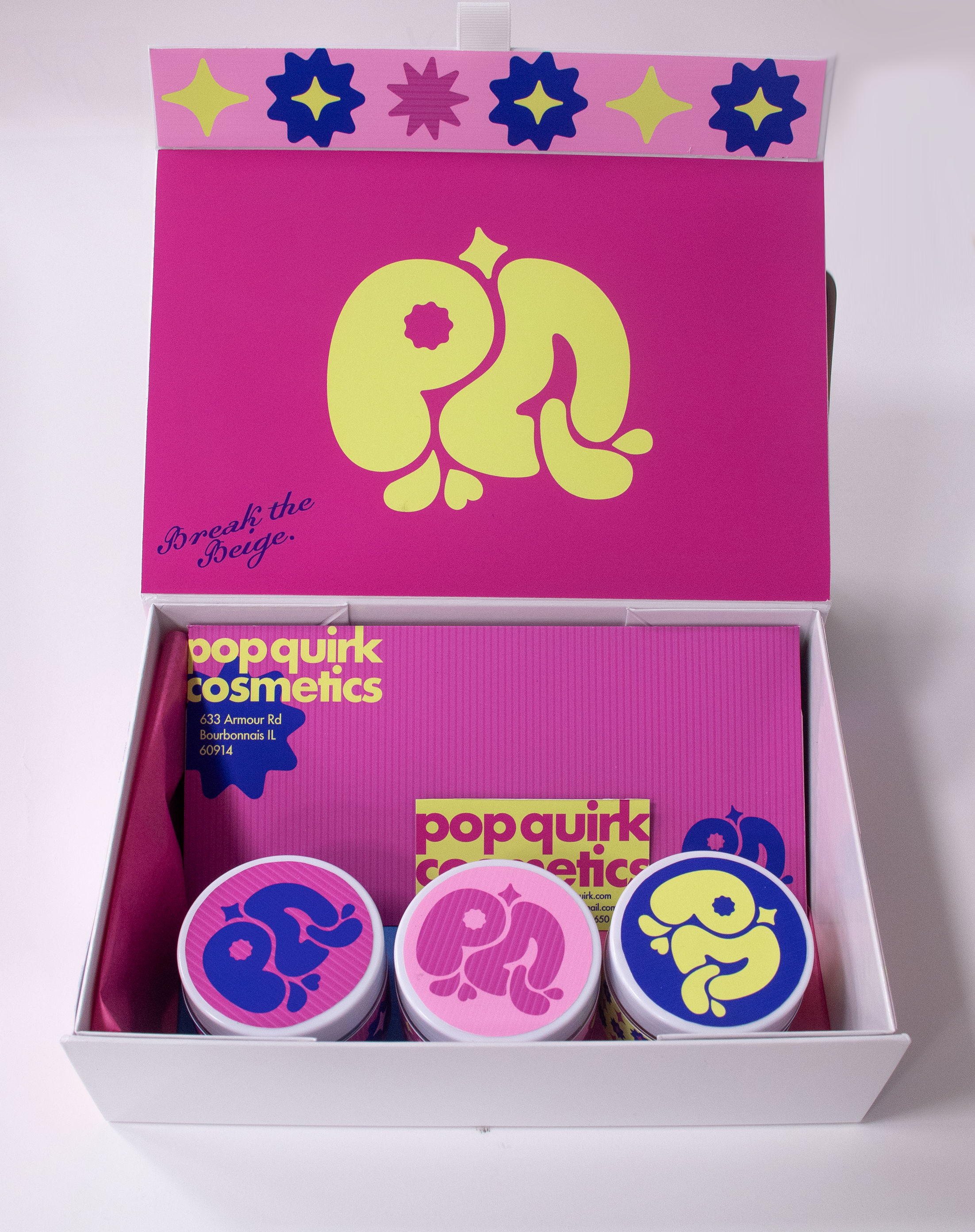
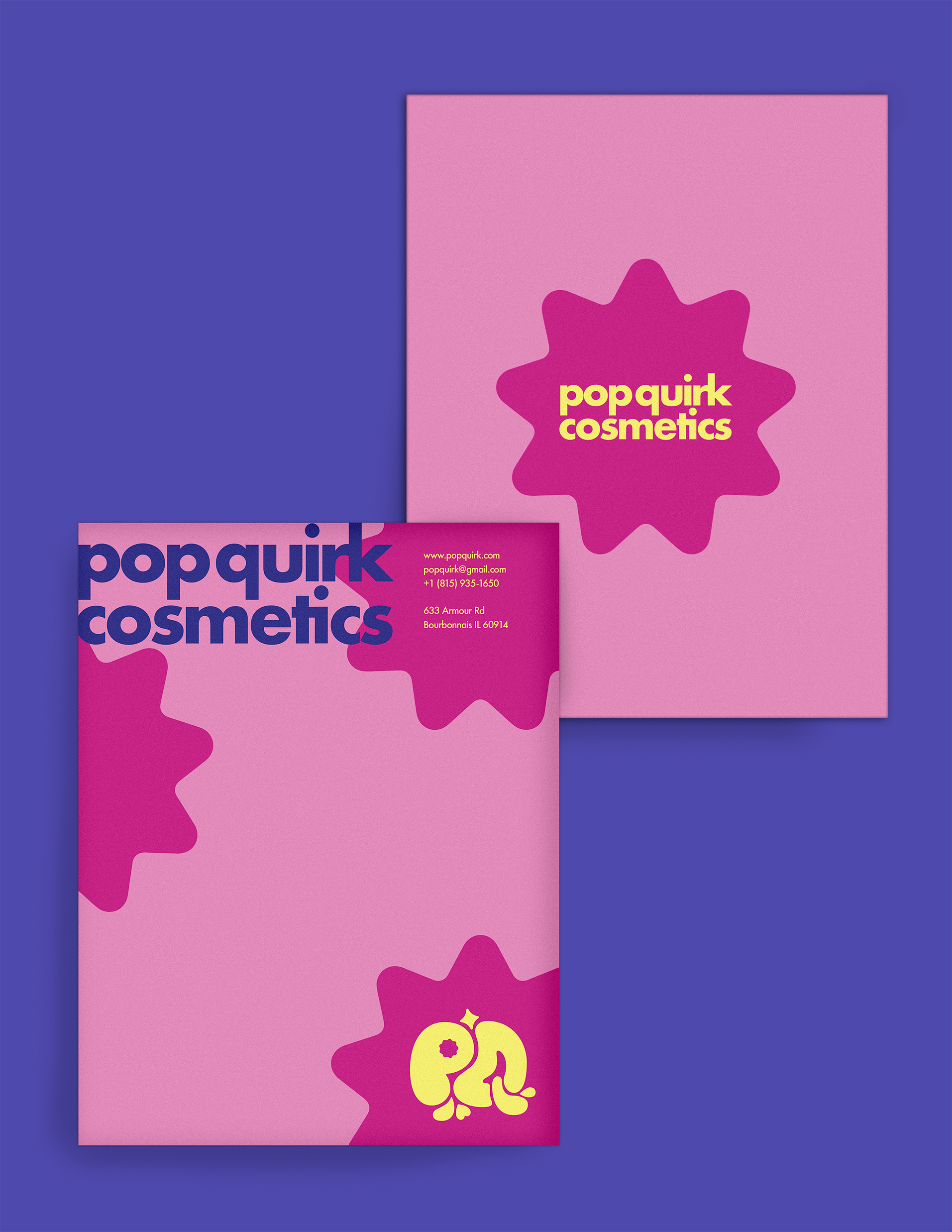
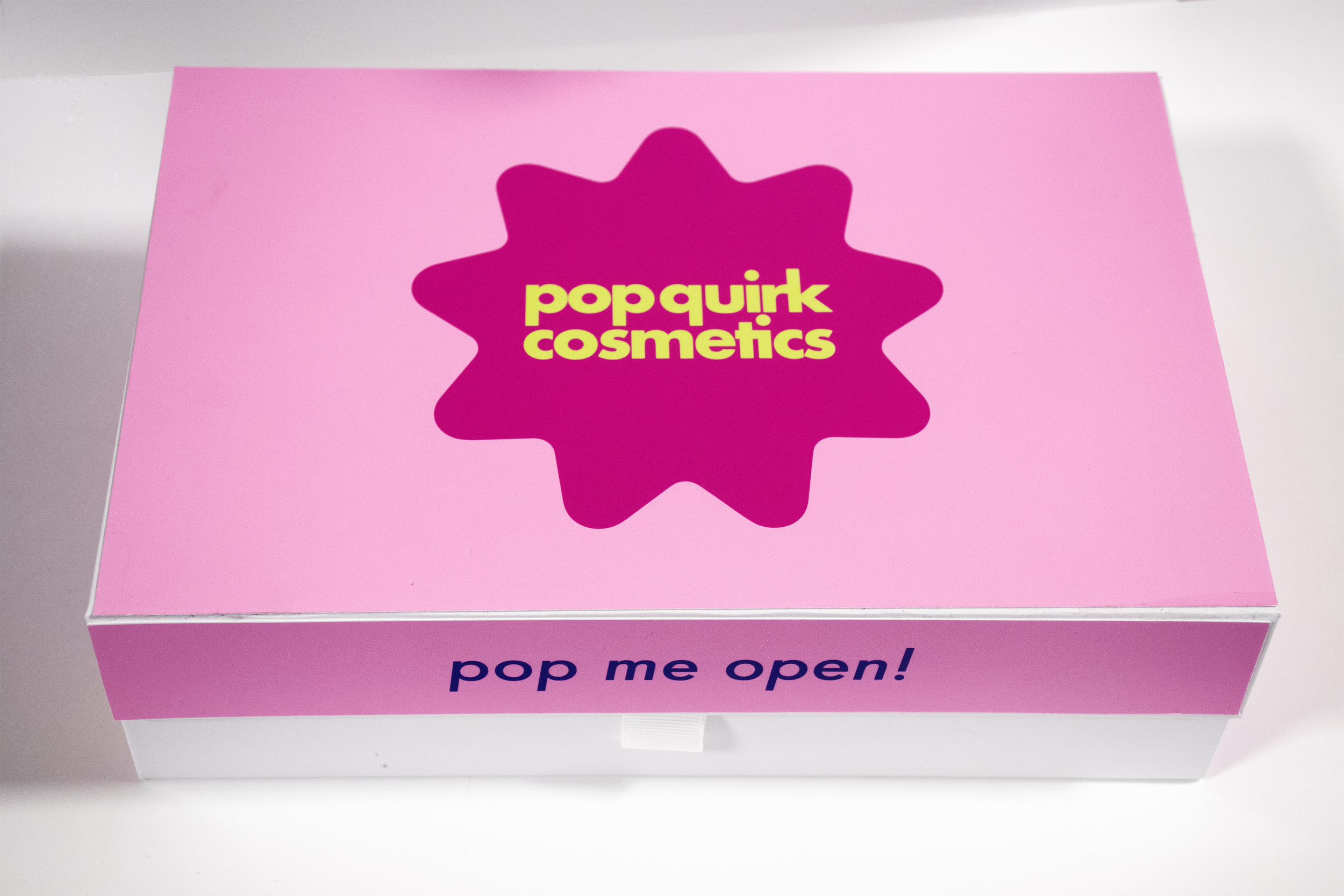
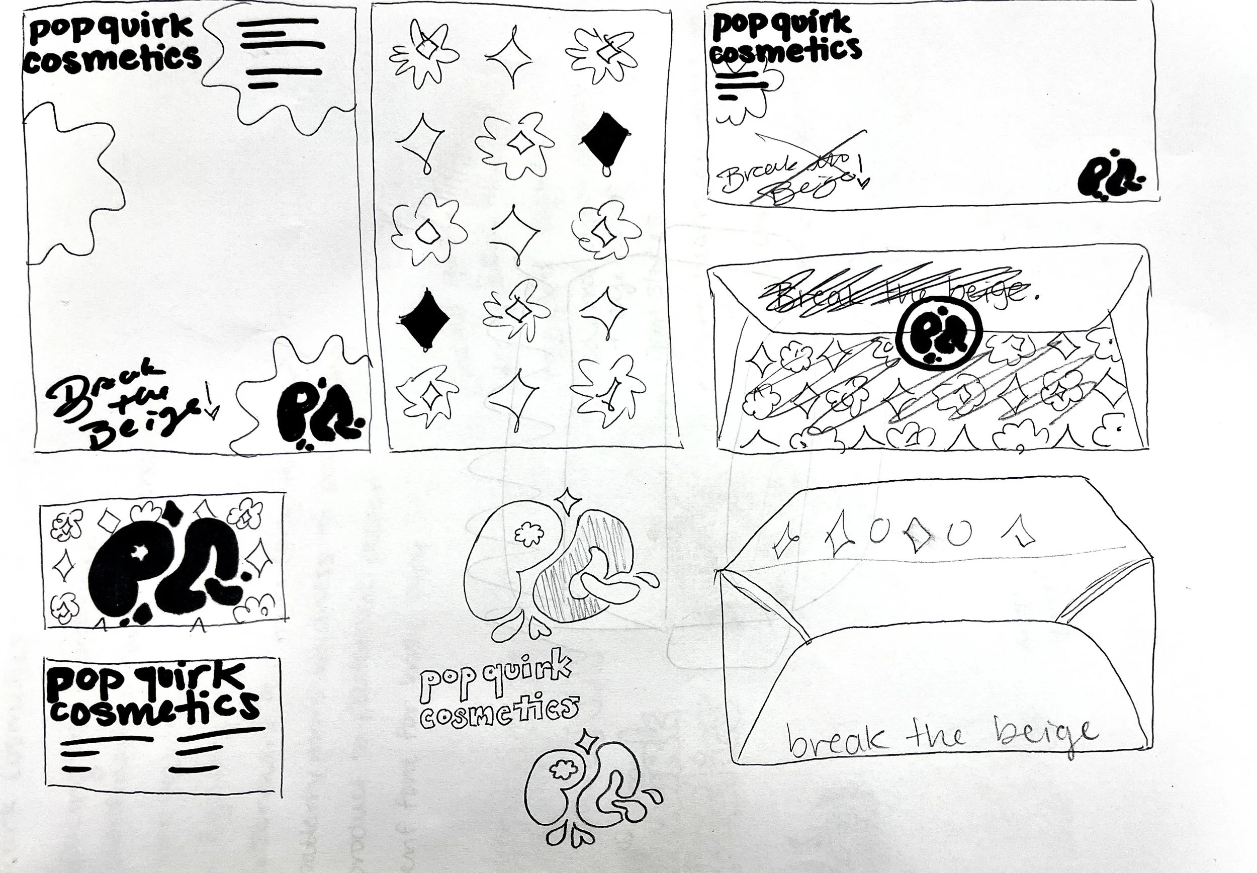
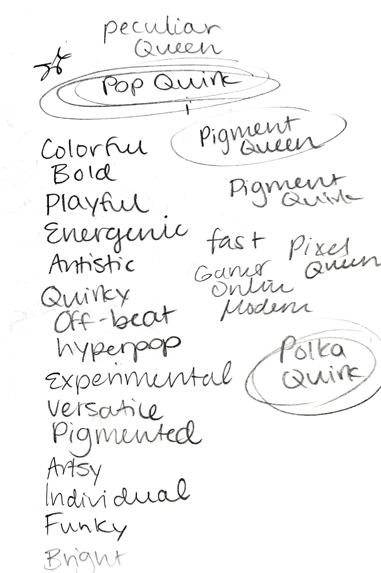
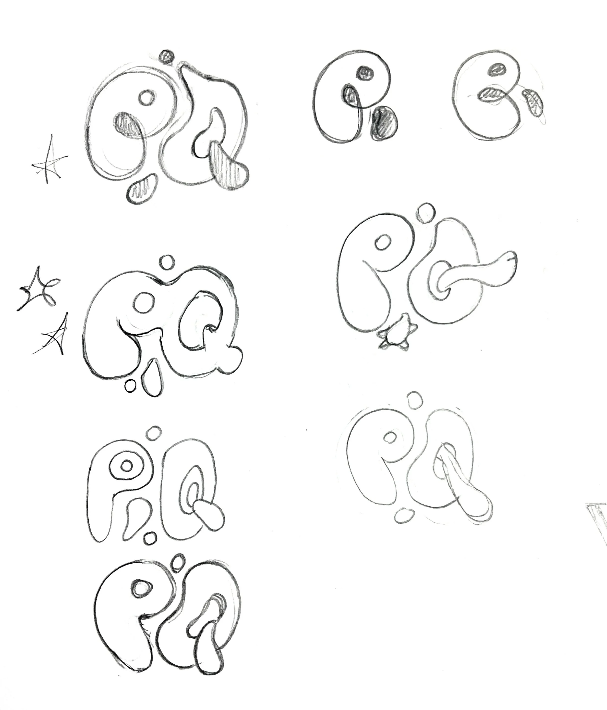
This project pushed me to create a more experimental and unique system. My first step was to create a custom lettermark, then I explored typefaces until I settled on a few that suited my vision. I spent a lot of time going back and forth with different colors and patterns. Eventually I found a combination that was versatile yet recognizable, and on theme with the branding. Using this system, I created several deliverables, including stationary, cosmetic packaging, business cards, and more.
Process